
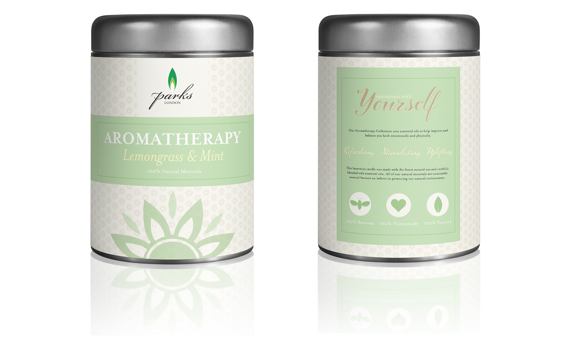
The product is a lemongrass and mint scented candle from Parks London's Aromatherapy Collection. Parks London is a luxurious, family owned candle company that only uses all-natural, sustainably sourced materials. Their Aromatherapy Collection is specifically targeted towards customers that want the same all-natural aromatherapy scents from professional spas.
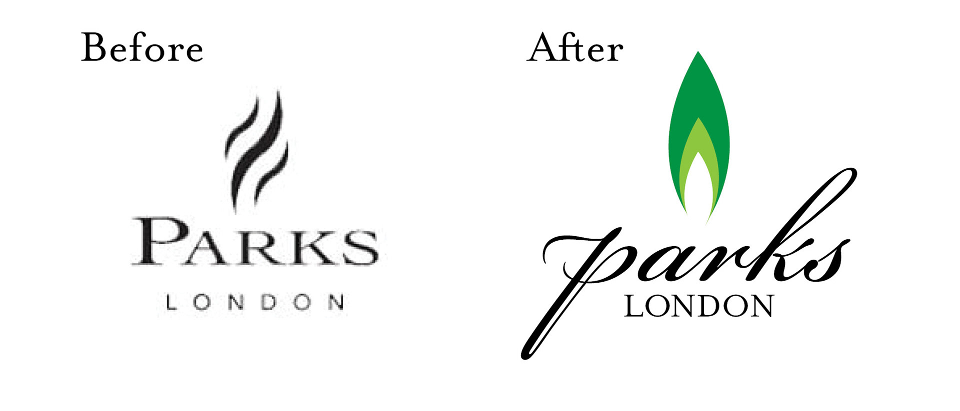
Behind the Logo
For my new logo, I wanted to mix together the fact that it was a candle product, but also that it was all-natural. I created a flame out of leaf shapes, and then used two green variations and white to seperate the leaves to create a flame. The orginal logo had a serif and sans serif. I changed the logo to have a script and a serif. I thought that the combination looked more elegant and high-end as opposed to the original logo.
Box Design
I wanted the design to have clean, somewhat minimal graphics. I used a green, pale yellow, and tan color scheme to represent the all-natural aspect. I used variations of Mrs Eaves (serifs) and Cinque Donne Bold (script) for the text. For the front of the tin, I only wanted the logo, product collection, scent, and "100% natural materials" on it. Basically, straight to the point information about the product. I also included a graphic flower that has petals made from the same style as my logo flame and leaves separating the petals to represent nature. I used this graphic and created a pattern of it in a tan color to go on the rest of the tin.
On the back of the tin I provided a sentence about the Aromatherapy Collection and then another two sentences about the company as a luxurious, all-natural brand. This information provides the personal connection with the customer. I reduced the transparency of the pattern so that it was not overwhelming, but added interesting graphics to fill the empty spaces in the background. I included the text, "Stimulating, Refreshing, Uplifting" on to represent three main words associated with the lemongrass and mint scent of the candle. I created three icons of a leaf, a bee, and a heart to symbolize the natural materials, the natural beeswax, and that the candle is homemade.