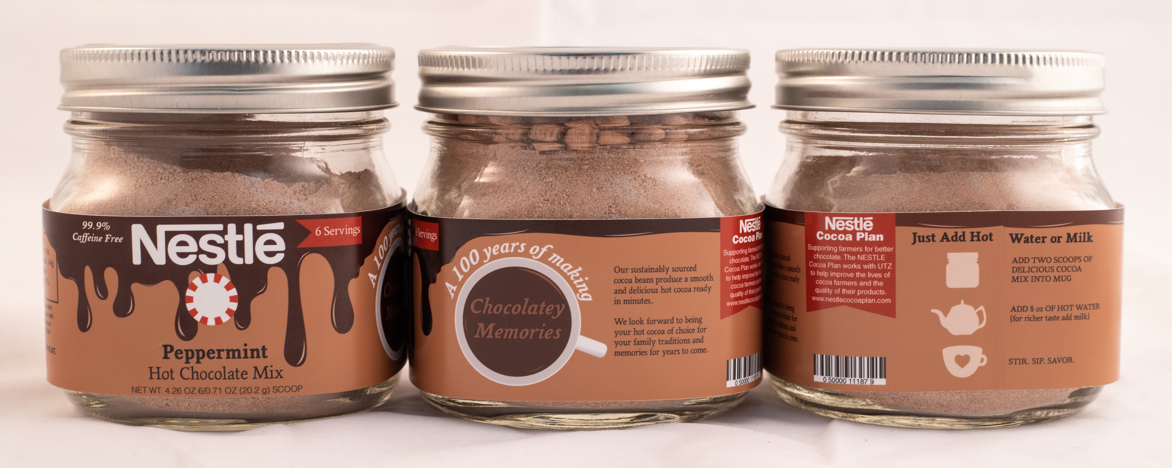
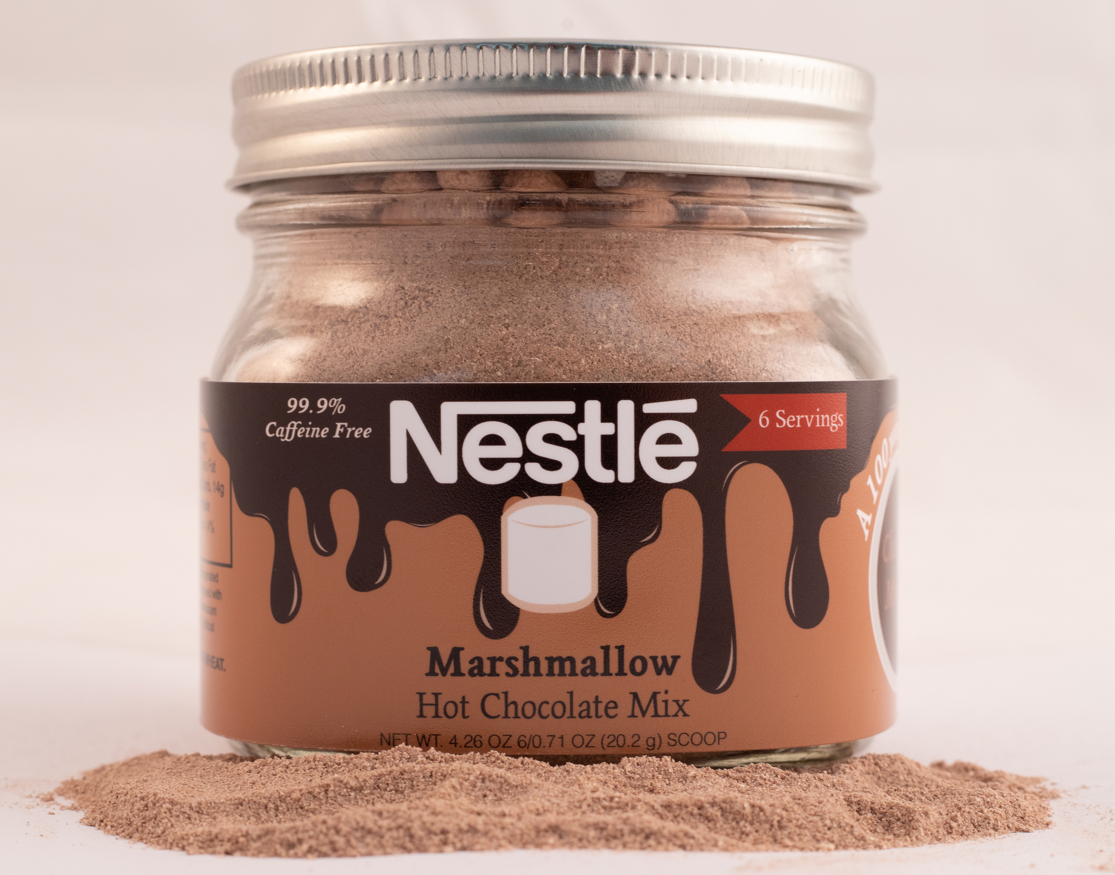

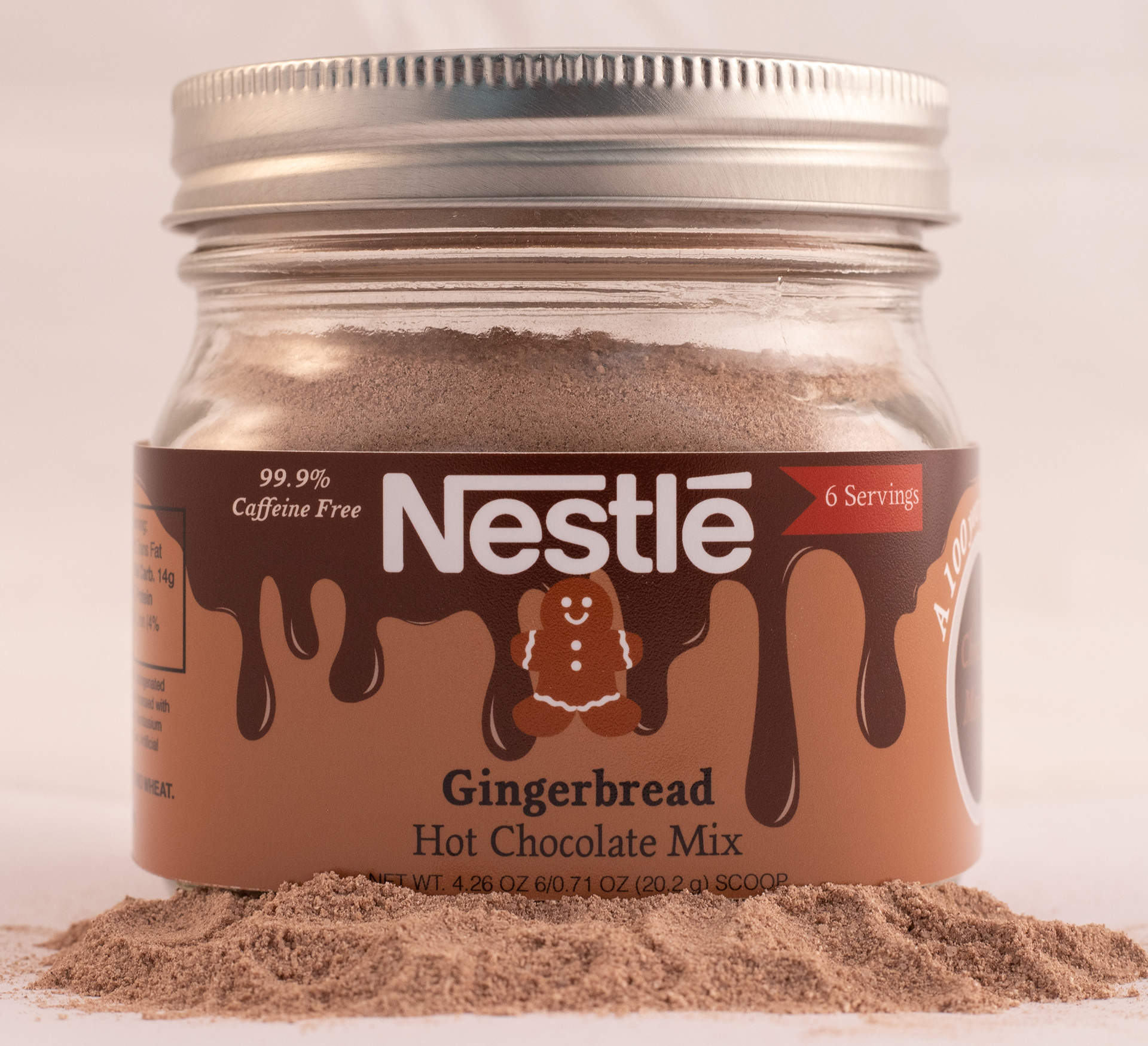
The New Concept
Nestle's original label design lacks personality, so I wanted to add some fun graphics into the label's design that would be appealing to all ages and make it family-friendly. I incorporated graphic icons to define the flavors so that the viewer would know what the flavor is without having to read the label. I also changed the colors of the chocolate drips to reflect the flavors so that when customers buy the product more frequently, they will just have to look for the color scheme for whatever flavor they want.
The Design
I chose a brown color scheme since the product is chocolate. I used red and white accent colors to allow color breaks from the browns in the label. I chose the font, Magpie, because it looked like a handwritten serif font. It gives me a calm, cozy feeling when I look at it. The font also has a large family, which allowed me to use the same font in different variations to keep the label consistent.