
About the Company:
Cove Jewelry is a high-end jewelry store that is influenced by the beach. All of the jewelry in the store is made from pearls, seashells, and any other beach materials. The tagline for the brand is “Exotic. Rare. Valuable.” I chose this tagline to represent that the company finds the most exotic and beautiful materials to use in their jewelry.
Behind the Logo
The logo design was created work with the name of the company. I surrounded the word “Cove” with a semi-sphere to represent a cove, a small sheltered bay. The circles were included to represent pearls and the starfish ties in the theme of the beach. I chose the blue theme colors based on color tones from the water. I chose the orange color in the secondary logo to add some vibrancy to the design.
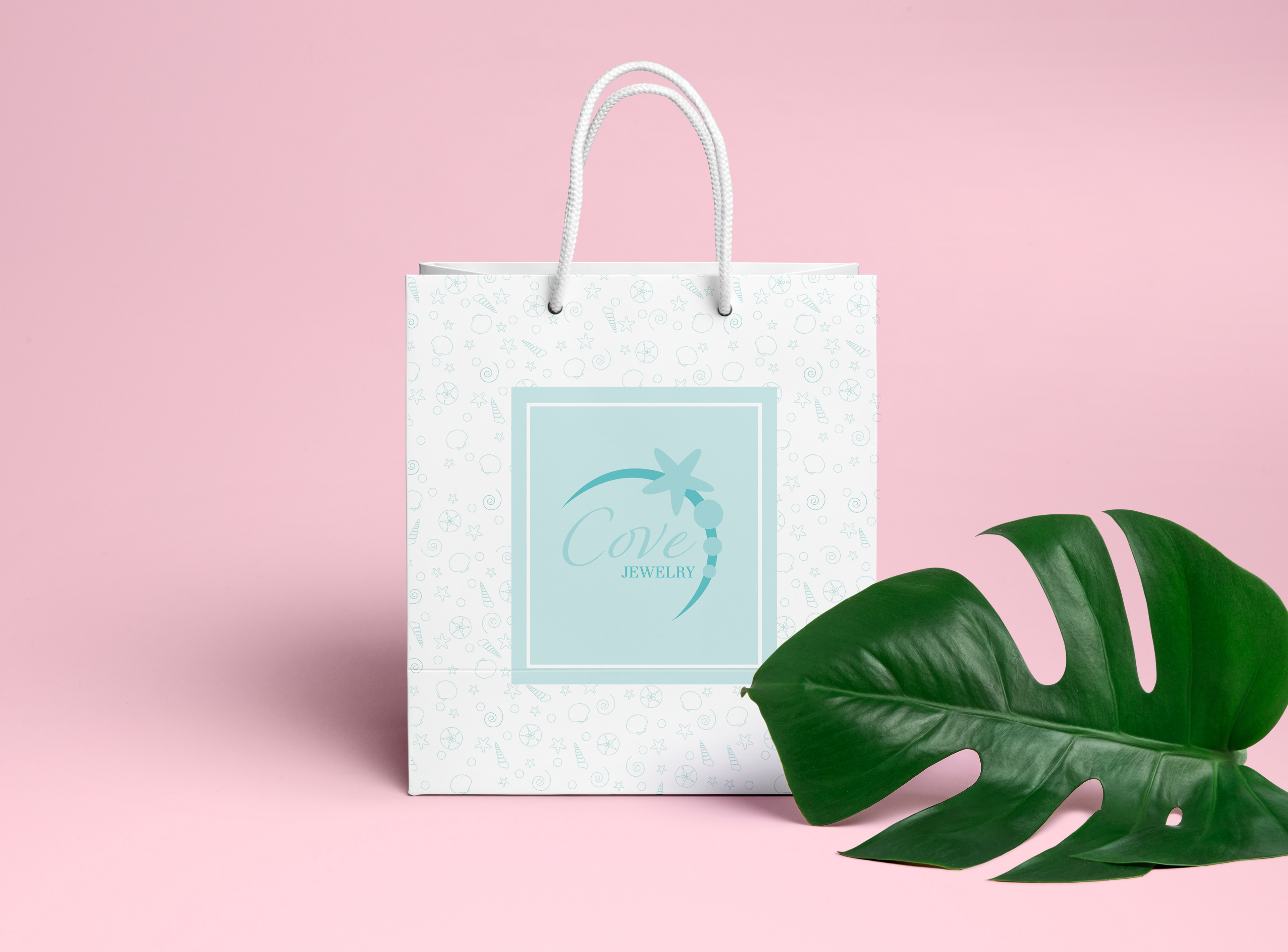
The Bag Design
For the consistency of my brand, I used the same three colors from my logo(s). In my research of jewelry logo and packaging designs, I noticed that the high-end brands use minimalism. The front and back panel of my bag is minimalist, using just a colored box with an inner white stroke and the logo. The background on the back is made up of small, stroked drawings of sea shells, pearls, and swirls to further the beach concept. I wanted to add interesting graphics, but I still wanted to work with the idea of minimalism, so I used a light tint of one of my blue colors. I did this so that the graphics were noticeable, but not overtaking.