This project is the most special branding that I have done so far because it is for my own company, Pretty Poppy Pet Photography! The name stems from my very pretty cat, Poppy.
When creating this brand, I knew that I wanted the logo to be simple, like a woodmark, and maybe include an icon within the typeface if I could find the right one. I searched endlessly for a perfect font with a wide "O" and came across this one below called "MADE Dillan". It had the perfect "O" for a cute pawprint! Since this typeface is so heavy, I wanted a narrow typeface so contrast it, especially with the tagline being long. I found "RooneySans" and it complimented the other typeface well.
I chose a bright red and light blue color scheme to create an energetic, vibrant mood. In my business cards and around my website you'll see that I used yellow as my third color. The love triangle of the primary colors lives on!
Business Cards
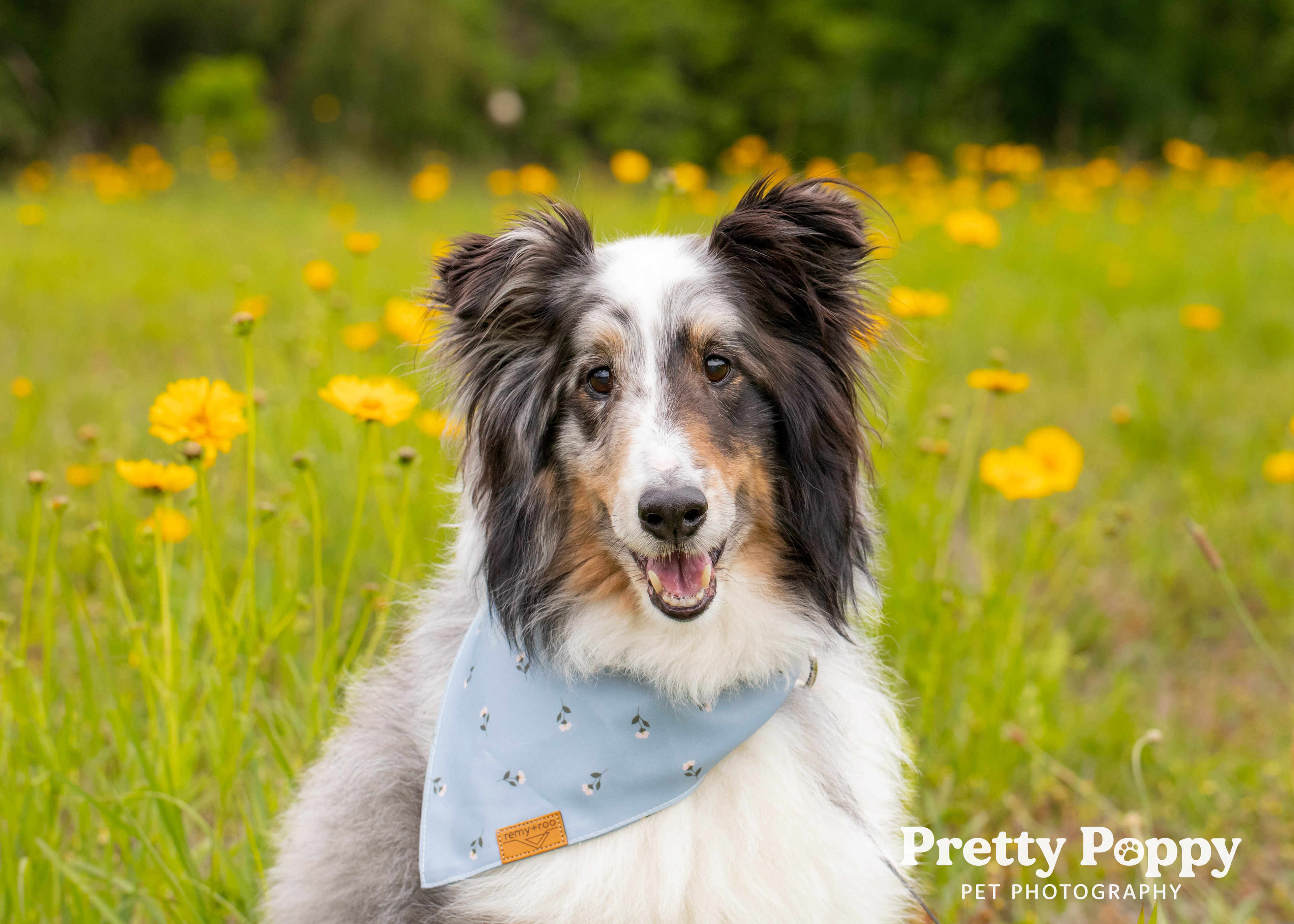
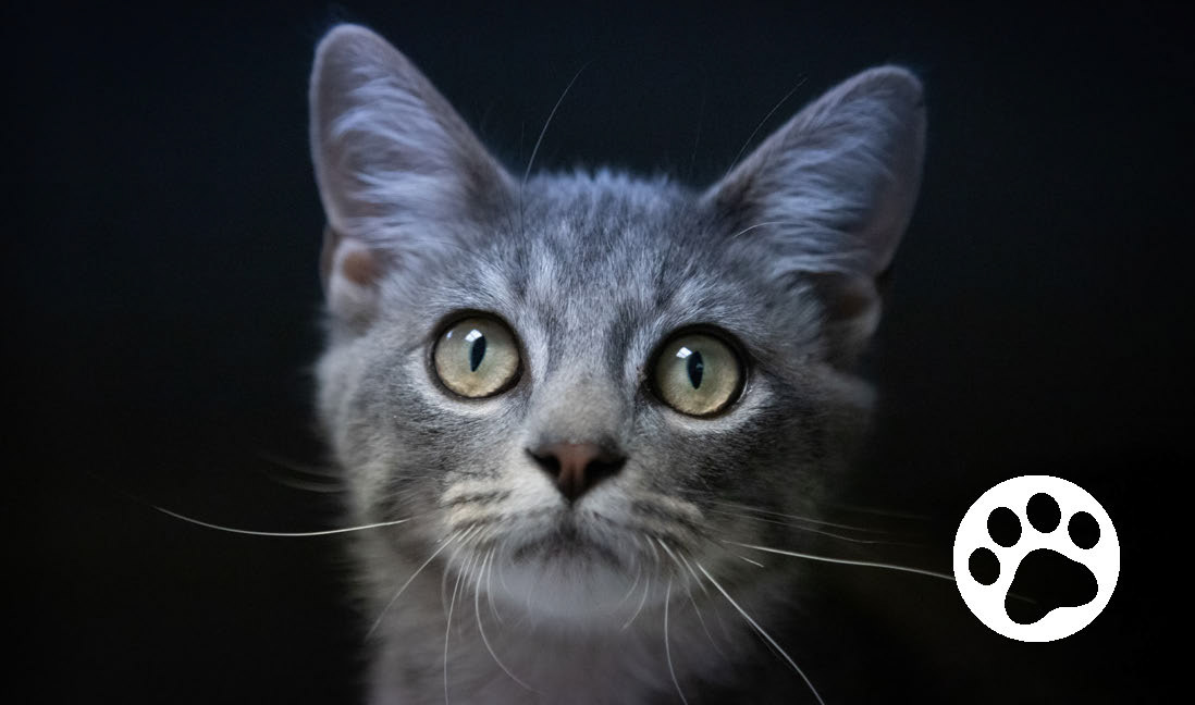
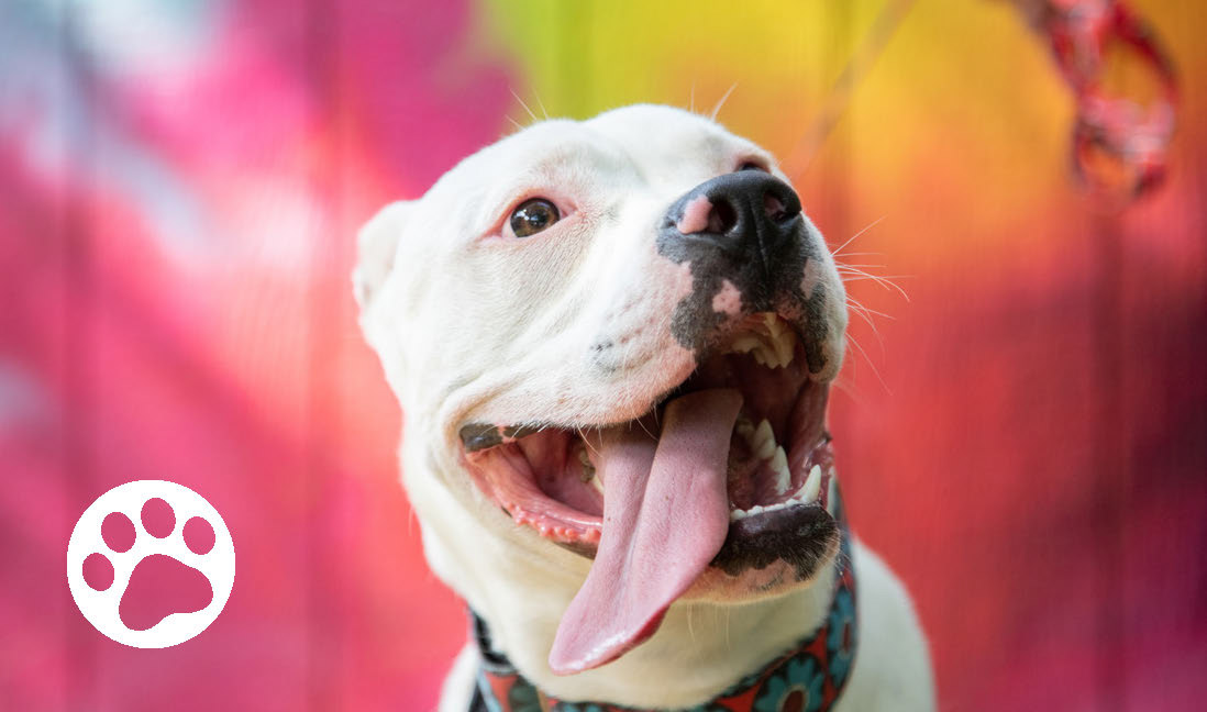
For my business cards, I wanted to represent a variety of animals as well as showcase some of my favorite personalities that I have encountered so far. To be cheesy, a picture can say a thousand words...so why put a bunch of text that no one is interested in? I want to grab the viewer with cute photos of animals so that they become interested in my work. If they want to get more information then they can continue to the back for some light information. When I have a booth at an event I put these cards all over my table with dog treats to fill the holes. Works like a charm to capture both the human and the dog's attention!


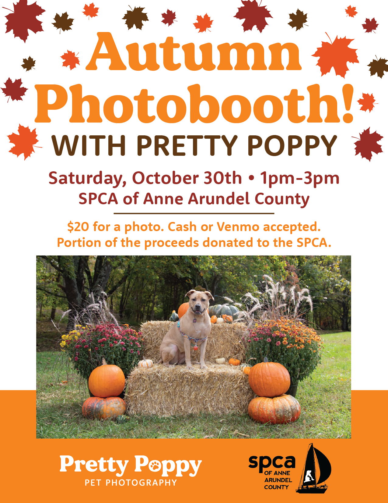
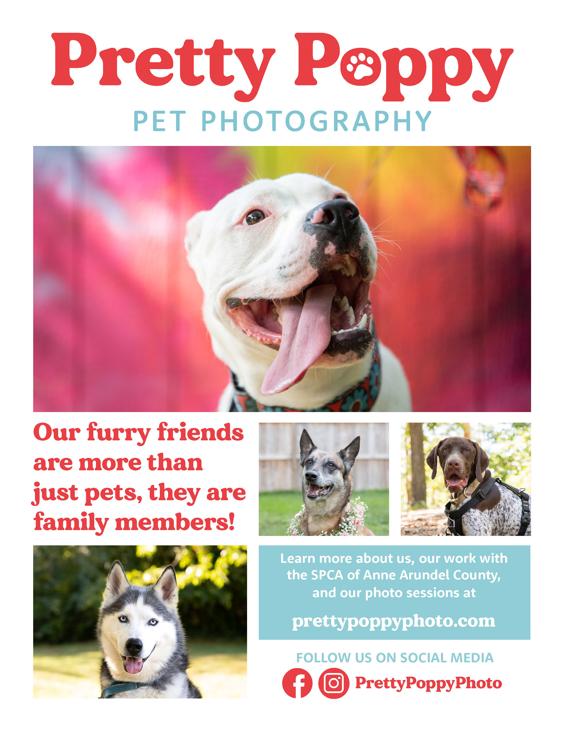
Flyer Samples